Check our new Guide
Learn how to partner with the right sportsbook provider and start your betting business with confidence.
Start reading
In our journey at GR8 Tech, we discovered the transformative power of design tokens. While they presented solutions, they also introduced challenges. Dive into our experience on how and why we streamlined our design system through automation with tokens.
At its core, design tokens encapsulate style values—think colors, fonts, and more. This ensures consistent application across designs, codebases, platforms, and tools.
A design token represents specific UI information. By naming a token, you define the visual attributes of an interface element. Consider this: if you create a token for a title and specify its style attributes, every title across the product will possess a uniform appearance.
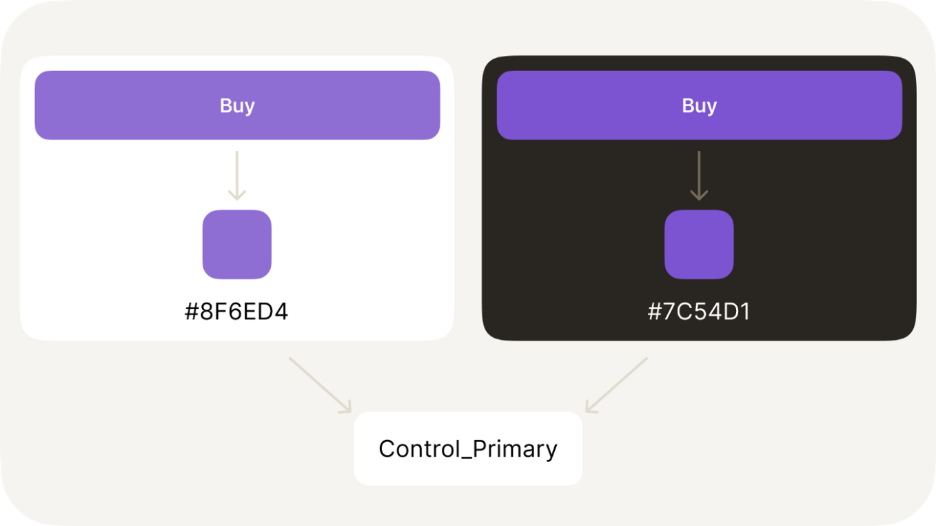
In the past, design style naming was largely guided by conventions like "Primary100", denoting the type and shade of a color. However, such naming lacked context. Contrastingly, design token naming zeroes in on the particular component or context where a style will be applied—like "control-button-regular".
Now, you might wonder: why invest in renaming? Challenges arise when re-theming. Take GR8's signature yellow—it's splendid in dark mode. But in light mode? It demands a switch to a deeper shade or perhaps a solid black. Without tokens, such shifts become cumbersome, necessitating manual hard coding.
Recognizing the inefficiencies, we knew we needed a sustainable system. That's when we embraced the game-changer: design tokens.
Design tokens streamline the design process in multiple ways:
Design tokens are indispensable for products that toggle between light and dark modes. Imagine crafting a single design and effortlessly flipping between modes: turning dark mode visuals to their light mode counterparts is just a click away. Moreover, they simplify global font replacements, especially if your product utilizes varied font pairings across platforms like iOS and Android.
Design tokens are akin to a comprehensive style guide. Designers no longer pause, pondering the right shade of gray for standard text or hints—the tokens’ naming convention already offers that clarity. This not only expedites the design process but also minimizes potential errors.
The real beauty of design tokens lies in bridging the designer-developer gap. The ease with which a designer can recolor a theme is mirrored in the developer’s experience. This unified approach ensures consistent aesthetics and functionality.
Harnessing the strengths of design tokens doesn't come without challenges. At times, we found ourselves inundated with an overwhelming number of tokens. Managing such an extensive system poses its own set of difficulties. Additionally, as we continuously refine and introduce new tokens, how can the development team track these updates?
Our solution: Embrace automation. We've ensured seamless synchronization between design and development by integrating Continuous Integration (CI) and adopting a Continuous Release cycle. Our CI tools diligently scan Figma styles, converting them into code. This means any stylistic change a designer initiates is instantly accessible to developers.
Without an automated delivery system for tokens, their utility diminishes. It's crucial for the design envisioned in the system to be a true reflection of the underlying code. Regular token verifications are what maintain this alignment between design and development.
Design tokens are indispensable for products that toggle between light and dark modes. Imagine crafting a single design and effortlessly flipping between modes: turning dark mode visuals to their light mode counterparts is just a click away. Moreover, they simplify global font replacements, especially if your product utilizes varied font pairings across platforms like iOS and Android.
Design tokens are akin to a comprehensive style guide. Designers no longer pause, pondering the right shade of gray for standard text or hints—the tokens’ naming convention already offers that clarity. This not only expedites the design process but also minimizes potential errors.
The real beauty of design tokens lies in bridging the designer-developer gap. The ease with which a designer can recolor a theme is mirrored in the developer’s experience. This unified approach ensures consistent aesthetics and functionality.
Within Modulor, our proprietary design system at GR8 Tech, we've employed a three-tiered hierarchical approach for naming design tokens:
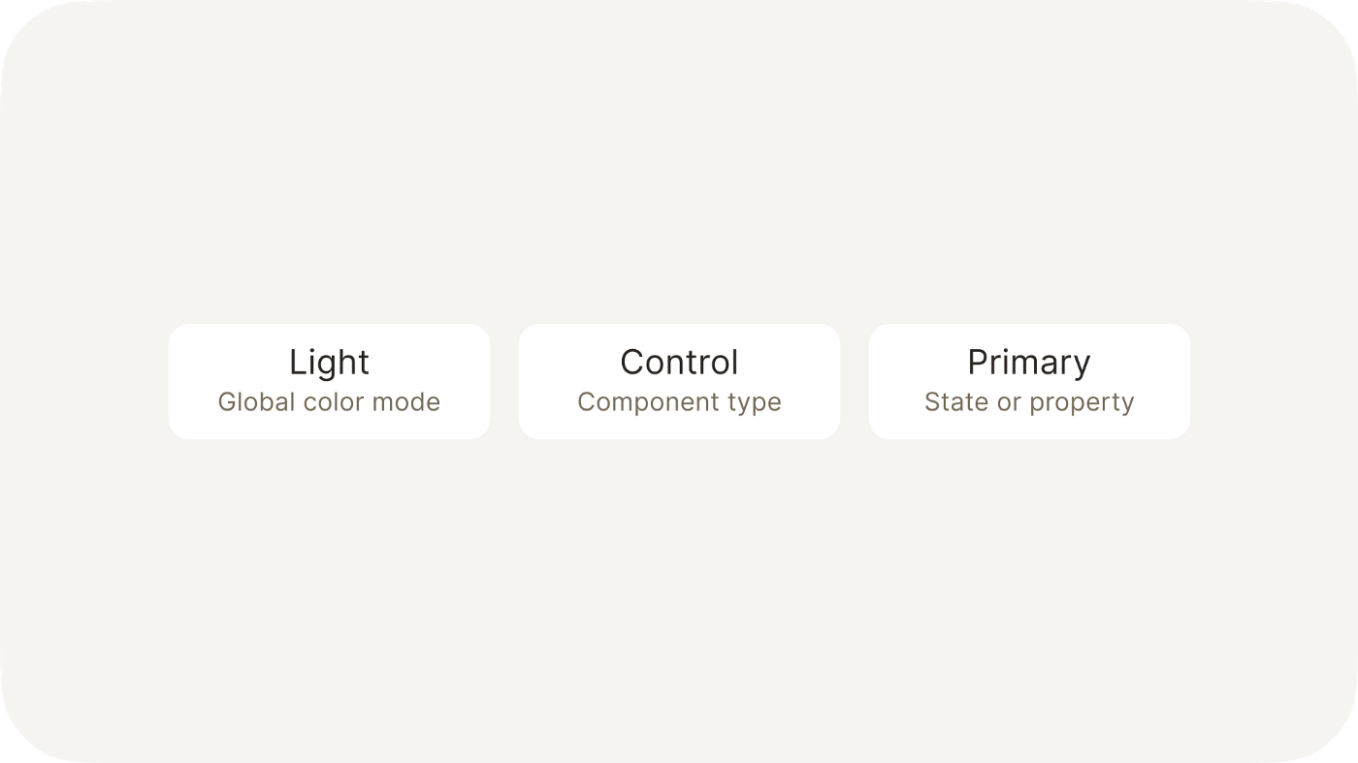
This structured naming convention facilitates both scalability and navigability within our design system. Plus, the token's name doubles as a directive for our developers. If they encounter a color labeled as "Title," its intended application—headings in this case—becomes intuitively clear.
While design tokens offer solutions, they occasionally birth new quandaries. Picture a scenario with a signature yellow color that's utilized across buttons, icons, switchers, and text. Given our naming strategy, every element gets its own token—even if the hue remains unchanged.
Maintaining a few duplicate colors is manageable. But envision a scenario wherein your brand's staple green has to be swapped for red across 45 tokens or consider a design system like VK's with nearly 200 styles. Anticipating the complexity such situations could introduce, we decided to be proactive.
Enter Token Master—our game-changing Figma plugin. Its specialty? Automating the color design token process. Tokens with identical HEX color values are grouped. Do we need to swap 45 green tokens for red? Token Master accomplishes it in mere moments.
Conceptually, Token Master acts as a universal token. In web development, token dependencies are a reality: modify a global token, and linked tokens adjust accordingly. Figma lacked this inherent feature, so we innovated and incorporated it.
Token Master has transformed our design process. Designers can now conjure a brand-new color scheme in roughly ten minutes. Without this tool, the same task would demand nearly two whole workdays.
Our journey with Token Master isn't confined to just color coordination. We're excited to unveil some groundbreaking features on the horizon:
Keep your eyes peeled for what's next!
GR8 Tech promotes responsible gambling. The content on this website is intended solely for B2B industry professionals and individuals who have reached the minimum age required for online gambling in their jurisdiction.